I plan on making a longer post about the exact math behind it all, root locus, characteristic roots, Fourier theory, all that jazz, but for the time being I just wanted to post a little thing I made that animates the s-plane, the transfer function, and the frequency spectrum magnitude and phase. I’ll probably update this post continually when I have free time.
The important thing to understand is that it’s literally the Pythagorean theorem, but as a fraction. A “pole” is in the denominator, so as the distance (calculated by the Pythagorean theorem) gets bigger, the response gets smaller. A “zero” is in the numerator, so as the distance to the point of interest gets bigger, the response gets bigger. That response also has a phase, which is just the angle from the poles and zeros to the point of interest.
Like I emphasized in the post about imaginary numbers, these are actually all pretty simple concepts combined in a non-intuitive way, but once you grab the branch that’s reaching out to you it all clicks. Pythagorean theorem, angles, fractions. That’s all you gotta know. “Eigenvalues of a homogenous linear differential” — shut up nerd.

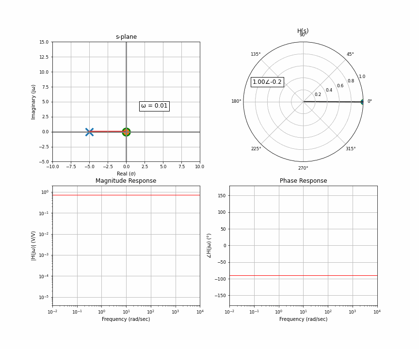
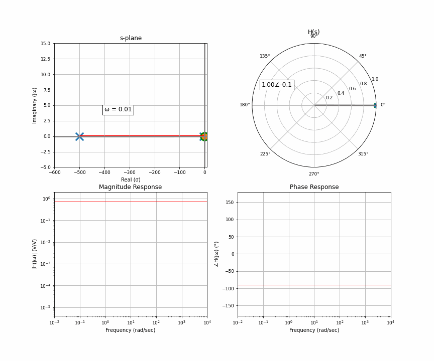
Here’s an animation of a sweep from 0 Hz through 10,000 Hz. In the upper quadrant is the s-plane, which we get from the Laplace transform. There’s one “pole” here, and you and I are the orange dot accelerating up the imaginary line a.k.a frequency. The upper right is the “response” at wherever the orange dot is. That means that for this system, if you input a sine wave with the frequency where the orange dot is, the arrow in the upper right represents the amplitude and delay of the output. The bottom row then represents the frequency response you may have seen. The upper left is the input in rectangular coordinates, the upper right is the output in polar coordinates. Polar coordinates are made up of a magnitude and phase (the number to the left of the angle and to the right of the angle symbol); the bottom row is simply the upper right graph split up into two graphs.
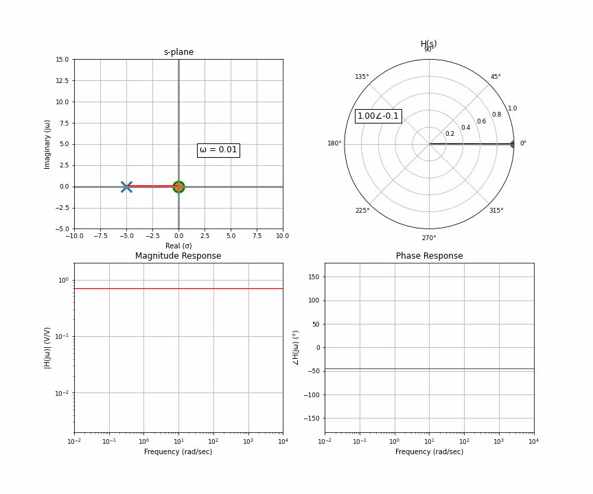
I want to clarify something here about the s-plane that can get lost in the sauce. The s-plane has a real and imaginary axis, yes, but each point on the s-plane also has a real and imaginary component. In other words, the s-plane is a complex plane of complex numbers. The upper left, the complex s-plane, is sort of like the x coordinate, and the upper right, the response, is sort of like the y coordinate. But because we as humans can’t figure out how to graphically represent single complex numbers as anything but a 2D coordinate system, this is what we’re left with. That’s also partly why the only thing we choose to represent on this graph is the poles and zeros, because it doesn’t require a second graph.
Let’s ask ourselves this: why does the position of the pole, which is away from the imaginary axis, affect the corner on the imaginary axis? Because that’s the 45 degree marker. The way we’re usually taught this is that the phase shift, the 45 degree shift at the corner frequency, is just a funny coincidence. This is misleading. The phase shift is why that’s the corner frequency in the first place. The phase shift is the physical mechanism, the cause, and the amplitude response is a result of that phase shift. But usually when we talk about filtering, we’re talking about reducing a range of frequency’s amplitudes since that’s how we perceive and process things, your ears don’t pick up audio that’s -160dB but perfectly in phase.
When the orange dot — us — is on the imaginary axis, if we move very slightly up and down, the distance between us and the poles and zeros — which are all around the plane — doesn’t really change. But as we move further away, per ya boi Pythagoras, when we get to 45 degrees, the two sides of the triangle are equal, and after that, the y-axis (imaginary here) dominates the relationship. Isosceles!!!
If the pole is at -10 on the x-axis, we the viewer have to be at +10 on the y-axis, for the frequency to dominate the response H(s). If we add a second pole to exactly where the first pole is, it just doubles the effect. Notice how the phase shift approaches 180 degrees now instead of 90.
I made this animation for those of you who want to know what a “dominant pole” looks like. Rather than putting two poles on top of each other, they’re far apart. Once again, it’s the 45 degree angle to each pole and zero that matters. Visualize it in your head, watch the animation repeatedly, you can see that that 45 degree angle is reached much faster by the pole that’s closer than the one that’s far away. It looks like a 1-pole system right up until…there’s a 45 degree angle with the second pole. And then the frequency part dominates for the second pole as well and now they both dominate.
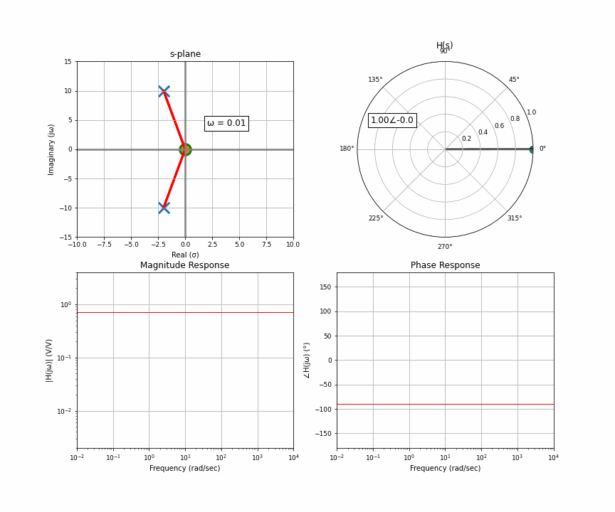
And now the final thing I want to animate for you is the case of two poles that are not purely real, there’s an imaginary component. Two poles that are complex conjugates of each other. This happens in things like an RLC circuit. So here’s a system with a pair of complex conjugates that are somewhat far away from the imaginary axis.
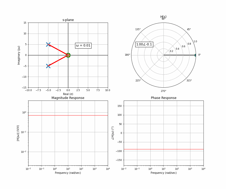
Notice something here. At the very start, you have two poles that have the exact same distance to the point of interest. As it moves up, the distance to one gets bigger but the distance to the other gets smaller. They cancel each other out. What this results in is a flat response riiiiight up until the orange dot moves past the upper pole. Then that upper one dominates, but when it moves far enough, they’re both like idk far away so it looks like a regular 2-pole system.
What happens if we take those complex conjugates and move them closer to the imaginary axis? That point right between they cancel each other and look the same, the point where one of them dominates, we move them closer. Two complex conjugates enter, one magnitude leaves!
This is peaking, or resonance, and is related to Q factor. This is really important in any sort of system with vibrations or resonance.
Anyways, I hope that these animations helped you guys visualize the relationship between the s-domain and frequency domain! It had been gnawing at me for a while so I made this and I figured you guys would like to see it! Speaking of gnawing, look who keeps biting and gnawing me for attention!

One thought on “S-Plane To Fourier: Cartoon Cartoons”